
Moving forward with Arabic typography
Renowned typography expert demonstrates use of Arabic lettering in a contemporary and bilingual setting.
AbiFares is a typographer, graphic designer, researcher and writer.
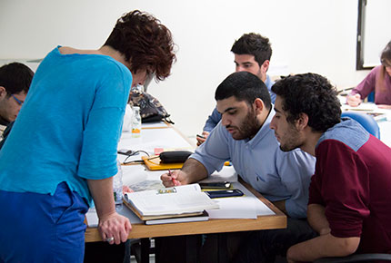
Group work during the workshop.
At first glance, working in Latin font is very different from its Arabic counterpart. There is a sense of greater freedom. This does not come from the font itself, however, but the mind frame of the designer.
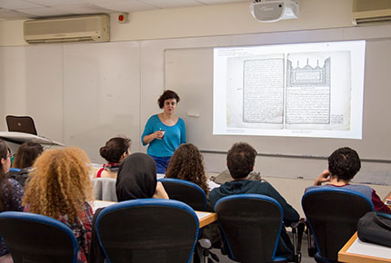
“When Western designers work with Arabic font they generate the same freedom,” explains Founding Creative Director of the Khatt Foundation, Center for Arabic Typography, Huda Smitshuijzen AbiFares. “Not knowing the conventions, and not being used to seeing the script, gives you a feeling that it’s new and so you are more free to invent.” According to AbiFares, we have to constantly unlearn what we know and then relearn or reinvent it. “I hope that is what they [the students] get out of this,” she says of a workshop on Contemporary Bilingual Typography and Lettering she was giving LAU 3rd and 4th year graphic design students earlier this month.
The workshop dealt with the practical application of typography and specifically bilingual typography using Arabic and Latin script together, an important regional topic but according to AbiFares “very problematic”. “I find that when designers start working in Arabic they get a bit cramped. It is like they are afraid of making change or they just get very conservative,” she says, adding, “They need to know how to work with these fonts, invent new things and be a bit more playful.”
As a typographer, graphic designer, researcher and writer, AbiFares works with whatever means and talent she has to make design a meaningful and positive part of people’s lives, specially in the Arab world. “I think that script should represent the people that use it,” she says.
By using very traditional script AbiFares believes we’re using the visual language of our great-grand parents. This gives the image that the Arab world is stuck in the past and doesn’t encourage young people to get involved. As a result they rebel. “And they should be rebellious in the way they design and create,” she points out. But also a lot of the old scripts don’t fit new technology. So even from the functional side often something needs to be done.
“For me typography is the tone of voice of the text. You can say it with a bad tone, a happy tone, a monotone and it changes the way people listen to it even though it’s the same text.”
Living in Lebanon, Jennifer Haddad, 3rd year graphic design student, deemed that learning how to link or match Arabic typefaces and English typefaces was important, “Our first language is Arabic but our generation always uses English and bringing Arabic back is vital because it’s part of our culture. Not only that but because it’s curvy you can do a lot with Arabic font. It has a lot of elements that you can work on.”
This was echoed by final year student Abdullah Al-Jajeh: “When I went to Dubai I saw how they empowered Arabic typography to preserve the language,” he pointed out. “It’s more than just an art. It’s about the whole social identity of the area we live in.”
More
Latest Stories
- LAU Honors Distinguished Alumni for Career Achievements
- Lebanon’s Cultural Heritage Enters a New Chapter at LAU
- The Tomorrow’s Leaders Class That Surpassed All Expectations
- NSSF Coverage Shapes Lebanon’s Labor Market, LAU Study Finds
- LAU Hosts Lebanese Diaspora Youth Connecting With Their Roots
- ELE Apps Prepares Future-Ready Engineers Through Real Projects
- Promoting Campus Safety With Life-Saving First Aid Skills
- Food Insecurity Takes a Toll on Pregnant Women’s Wellbeing in Lebanon